
+40
رفضت
Icon Color Option
davehocum منذ 9 سنة
في Metrology Software / PC-DMIS
•
تم التحديث من قبل Kingsld1 منذ 5 سنة •
23
• 5 مكرر
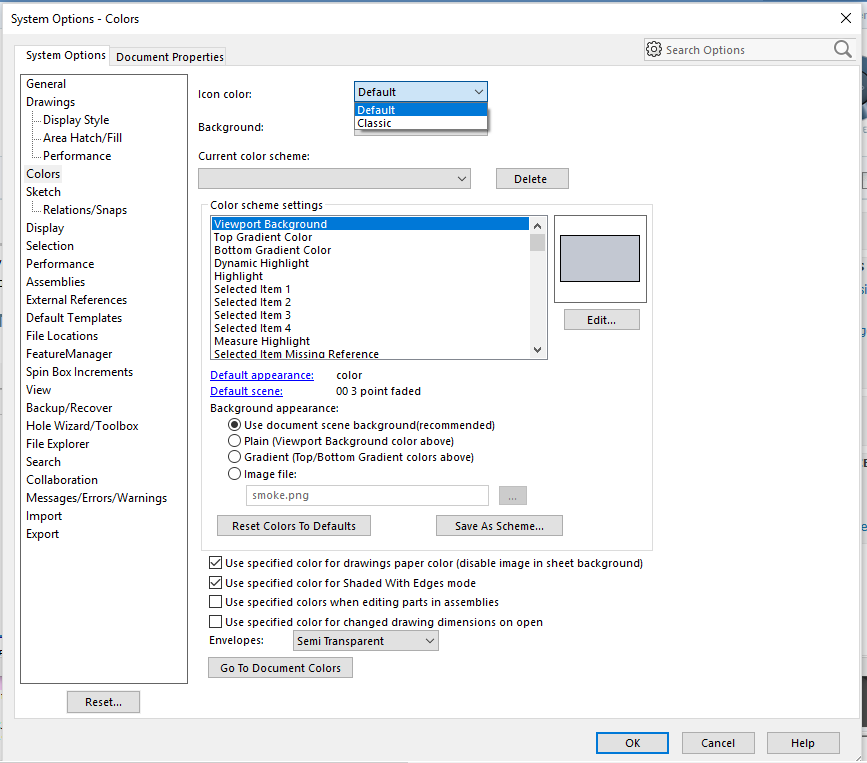
SoildWorks added a Icon color option. The option is to be able to change the Icons color from Default to Classic. Maybe they could do this with PC-DMIS to have a Icon color option.
SOILDWORKS 2016 User Interface
مكررة
5
خدمة دعم العملاء من خلال UserEcho

Something needs to be done with the blah looking icons in the 2017 R2 version. I take it marketing was playing software programmer???
I am seeing this type of color contrast in other softwares now. Autodesk Fusion 360 also has the icons with this type of blah contrast.
At least, give us an option to choose between old or new icon set.
I remember when SolidWorks change the Icons color and contrast for version 2016. There was such an outrage on the SolidWorks Forums over the change that SoildWorks added a Icon color option. The option is to be able to change the Icons color from Default to Classic. Maybe they could do this with PC-DMIS to have a Icon color option.
https://forum.solidworks.com/thread/107846?start=0&tstart=0http://www.pcdmisforum.com/forum/pc-dmis-enterprise-metrology-software/pc-dmis-for-cmms/406063-pc-dmis-2017-r2-is-released/page2
Agreed, they seem to be very poor choices. The install still has the old icons when extracted so maybe this was a programming oversight that linked both auto and manual icons to the same icon template?
I think I need to add a comment from our recent "PC-DMIS Days" with a lot of customers. The ones that were already quite used to PC-DMIS mainly disliked the new icons, but the ones that were (relatively) new to PC-DMIS said "They are great! Finally I can understand what all the little buttons do!".
I do not care old or new... I will adapt, but make them logical. I have icons that are identical to some other functions and it is a mess... If you change icons, finished them at first, I have some new and some old icons.
The Measured and Auto Feature icon colors will be distinct in 2018 R1.
They are different colors in 2018 R1, due to release soon.
The default is for large toolbars, but you can go to the Customize Toolbar dialog and uncheck the Use Large Toolbars option to make them smaller.
2018 R1CAD with IP measure Sample of small Icon and color.
2018 R1CAD with IP measure Sample of Large Icon and color.
Regarding the sizes - there are three sizes of icons available in PC-DMIS
16x16, 32x32 and 64x64.
On normal DPI systems, we use the 16x16 as standard size, and the 32x32 as large size. This is as it has been for many years.
On higher DPI systems, we use the 32x32 as standard size, and the 64x64 as large size. This new larger size was added in 2017 R2. On high DPI systems we tested on, the 16x16 was really illegible, so we decided not to offer that size in the UI. Similarly, the 64x64 on normal DPI was far too big, so again, we decided not to offer that either. This kept the UI simple, with just a "Use Large Toolbars" option, that we'd had for a long time.
If things look too big with small, it sounds like we're classing your system as high DPI, but perhaps it's not that high.
Can you send a screenshot of the whole PC-DMIS screen showing a few toolbars, and also indicate the monitor resolution you are running at?
Thanks
If the above screen shots are correct, the auto and measured features are still the same color. This is in addition to an overabundance of the, not in a good way, sick blue green used throughout the tool bar set. If you're looking for something, it all blends in together. Work flow, concentration and productivity are hurt from hunting for the right icon.
Ultimate solution would be user choice of color schemes for individual tool bars.
Solidwork had the same issue with their color contrast changes and decided to setup an icon color option from Default to Classic.
While I don't care for the new icons, I hate the new color pallet. The feature icons blend in to much with other toolbar icons. I should be able to look at my toolbar and be able to immediately tell one set of controls from another. If Hexagon wants to move in this direction for new users, at least give the old programmers the option to select a "legacy" set of icons to use such like they did with dimensioning.
Great idea. I just trained a group of new programmers at their facility using the "classic" 2017 R1 interface. They struggled with basic alignments, clearance moves, etc., as most new programmers will, but they had the most trouble navigating the interface because they were new to software/computers in general. By the end of the week we had developed custom toolbars and a simple layout and they were starting to "get it": they knew what their "buttons" looked like and where to find them.
On the last day they asked if I could upgrade them to 2018 and I advised against it because of the drastic changes to colours, icon symbols, etc.; they would struggle even more in 2018. An option to revert to a classic layout would have helped in this situation.
I'd vote for this but unfortunately I'm all tapped out for votes. Can I buy more?? (haha)
There’s a saying that goes like this: “A user interface is like a joke. If you have to explain it, it’s not that good”.
Read this on the Fusion 360 blog by
Keqing Song
Fusion 360 Product Manager
basically, I agree 100% to have options to choose between "classic icons" and "new icons". i dont want to learn new icons after very long years of working with old icons. I dont even have time to study a new function to maximize pc-dmis productivity. please make it happen from 2019 R1.
I agree. I would like the option of setting the toolbar icons from classic or new as well.
Additional posts on this subject.
Link: Icon Color Option
Hello all,
The interest here is clear, and internally we also like the idea. Unfortunately after reviewing this item during planning for the last four versions it's time I decline the request.
This is a difficult decision especially given the interest, but I think it's better to acknowledge that this item isn't making it onto the roadmap and return everyone's vote rather then continue to evaluate the request every six months.
If our toolbar architecture changes in the future making this item more reasonable in size I will absolutely re-open the request.
Call me stupid (again) but it should be a simple matter of swapping out some graphics files.